Overview
As part of a full product rewrite in Flutter, I contributed to redesigning and rebuilding the WeAre8 design system to support scalability, consistency, and efficient collaboration between design and engineering. This initiative ensured the system was flexible enough to support new features while maintaining a cohesive user experience across platforms.
The Challenge
The existing UI needed to be adapted for a new technical stack while also addressing inconsistencies across components, typography, and color usage. The design system had to:
- Scale across features and teams
- Work seamlessly in light and dark mode
- Reduce design and development friction
My Role
- Leading the redesign & creation process of the design system
- Redesign and creation of reusable UI components (with auto-layouts)
- Design system foundations (color, typography, spacing)
- Collaboration with developers
Key Contributions
🧩 Component Redesign & Structure
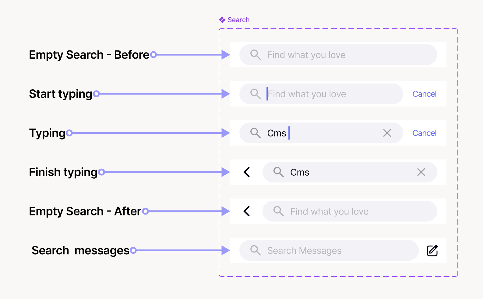
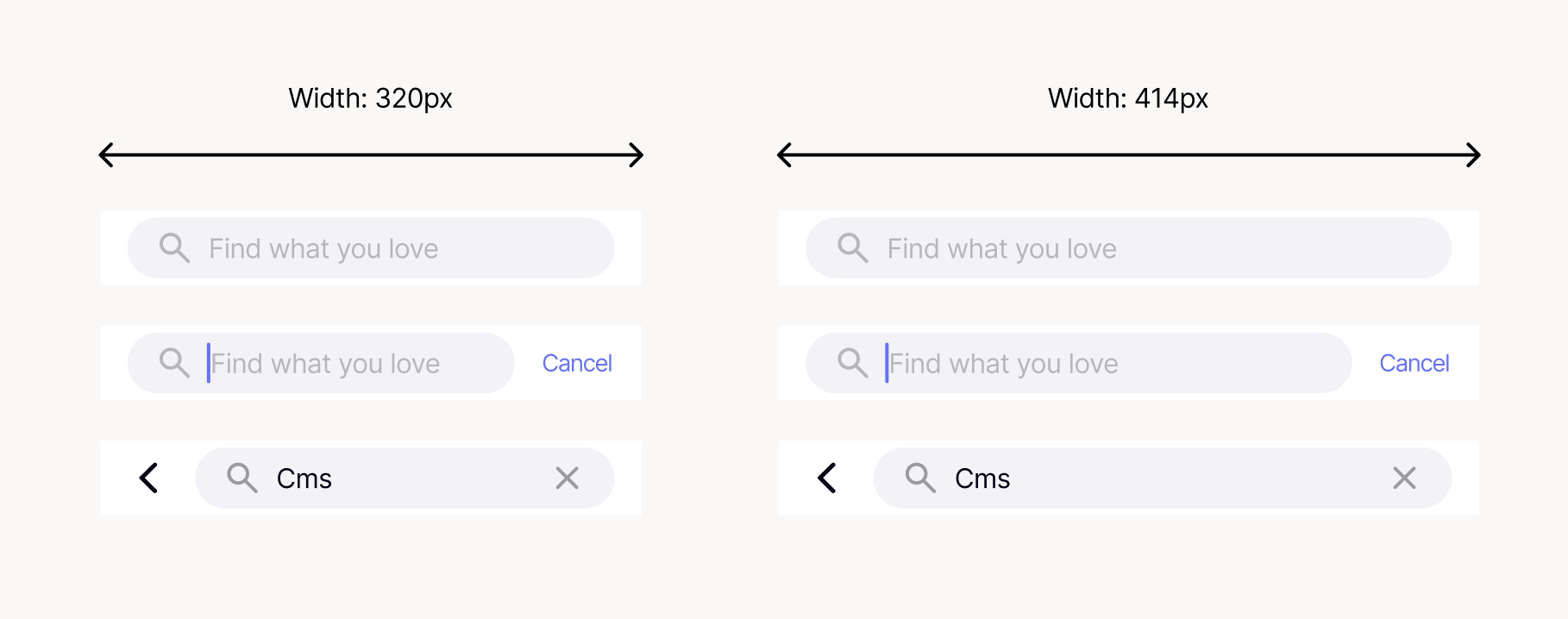
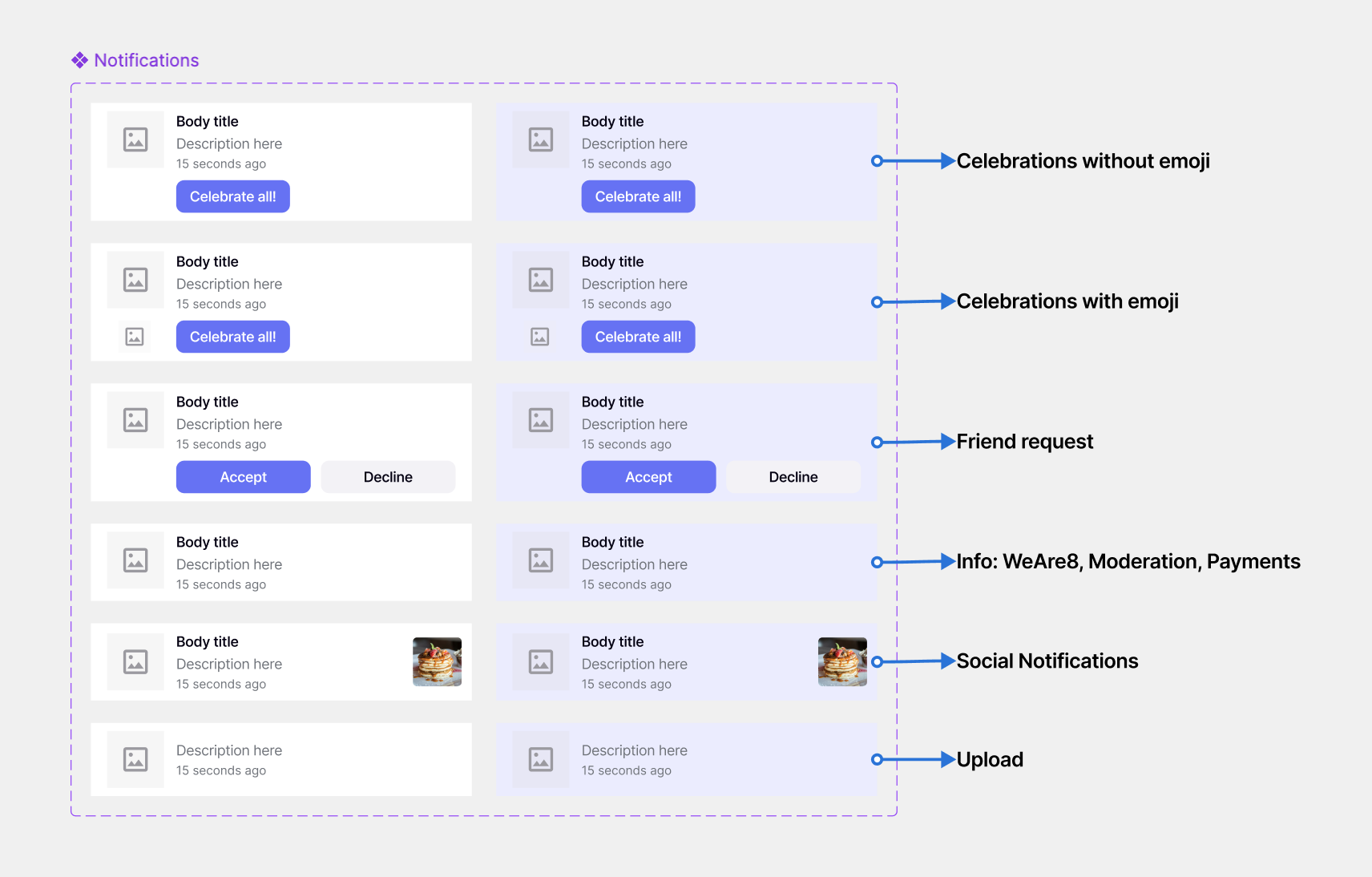
I redesigned core UI components using Auto Layout and variants to ensure flexibility, responsiveness, and ease of maintenance. Components were built to adapt across screen sizes and use cases while remaining consistent and predictable.
Focus: scalability, reusability, developer-friendly structure
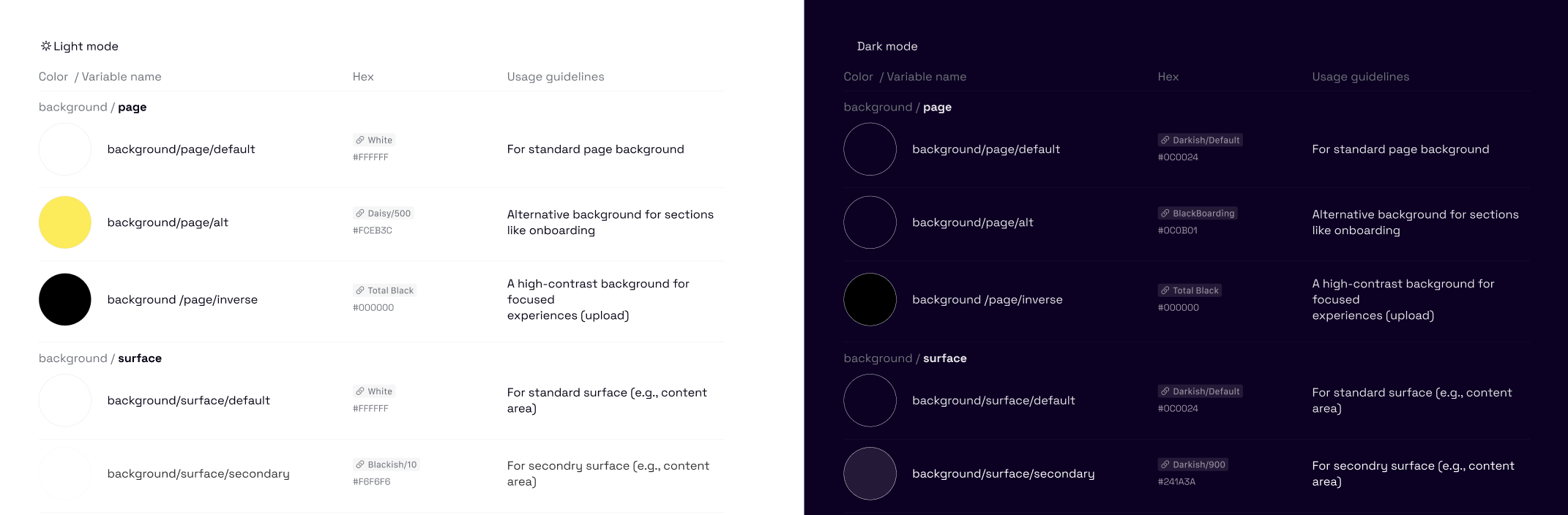
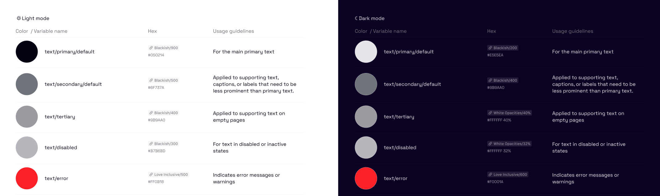
🎨 Semantic Color System (Light & Dark Mode)
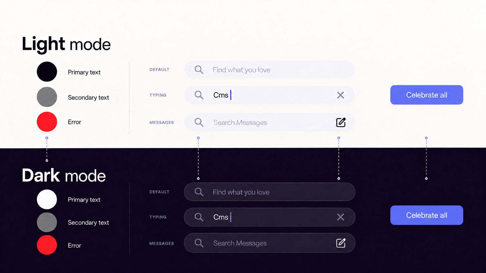
I designed a semantic color system that separates intent from visual value (e.g., primary text, secondary text, error states), enabling consistent meaning across the interface and easier theming.
This approach allowed:
- Clear meaning across contexts
- Easier theming for light and dark mode
- Better alignment between design and code
As part of this work, I designed and implemented the app’s dark mode, ensuring accessibility, visual balance, and maintainability across themes.
Overall, this system improved accessibility and made future design and product updates easier to scale and manage.
✍️ Typography System
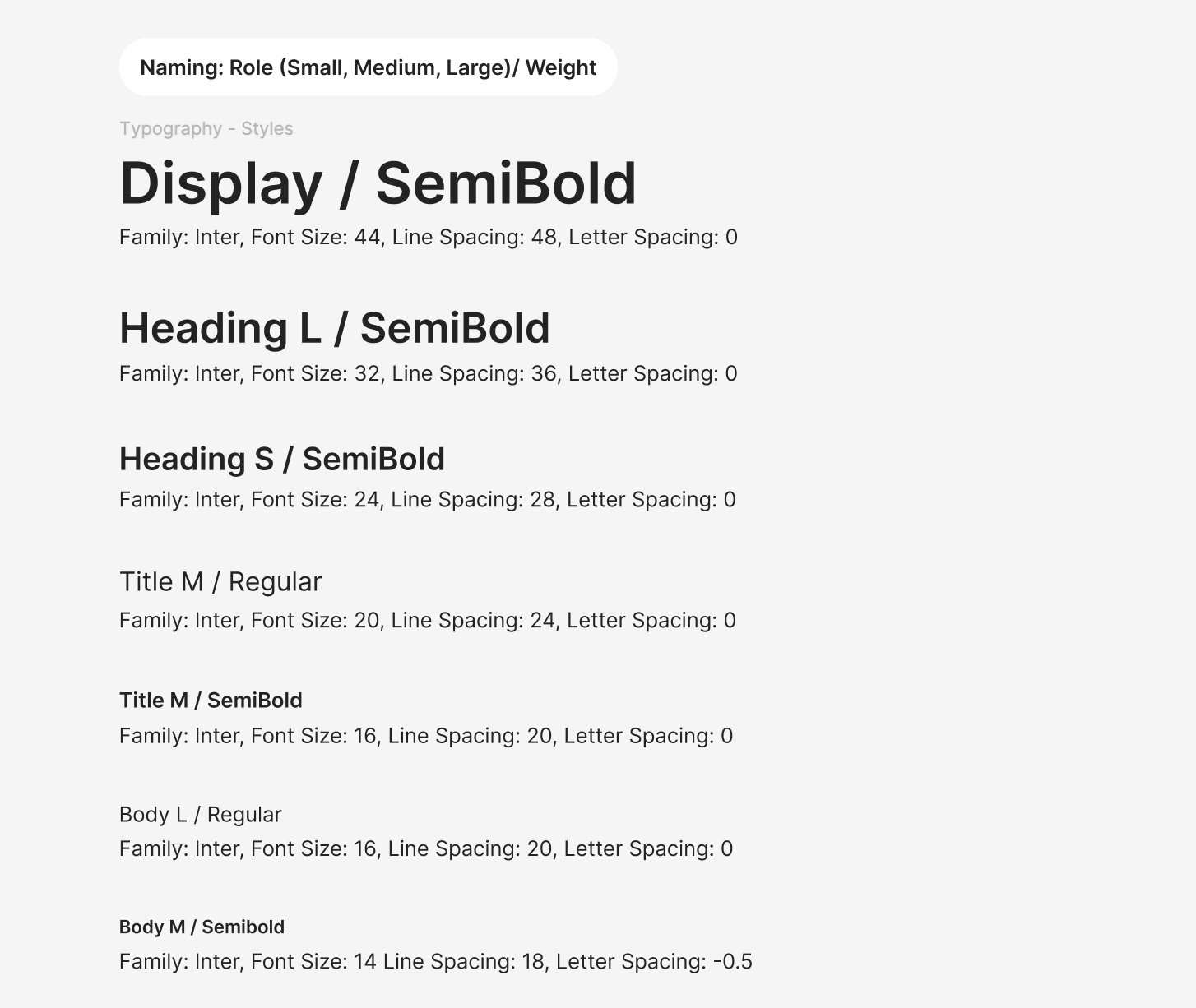
I refined the existing typography system by updating the font family and improving text styles to better support readability and hierarchy. The styles were adjusted using consistent font families, weights, sizes, line heights, and letter spacing, and renamed to clearly reflect their purpose across the system.
Multiple typography styles were introduced to support the diverse content and interaction patterns of a social media product, ensuring clear hierarchy and consistent usage across a content-rich experience.
These changes improved visual clarity, ensured more predictable usage of text styles, and made the typography easier to maintain and scale across the product.
Impact & Outcome
- Improved UI consistency across the product
- Faster design and development iteration
- Clearer handoff between design and engineering
- A scalable foundation that supports future growth
This work strengthened the product’s visual coherence and improved long-term maintainability.
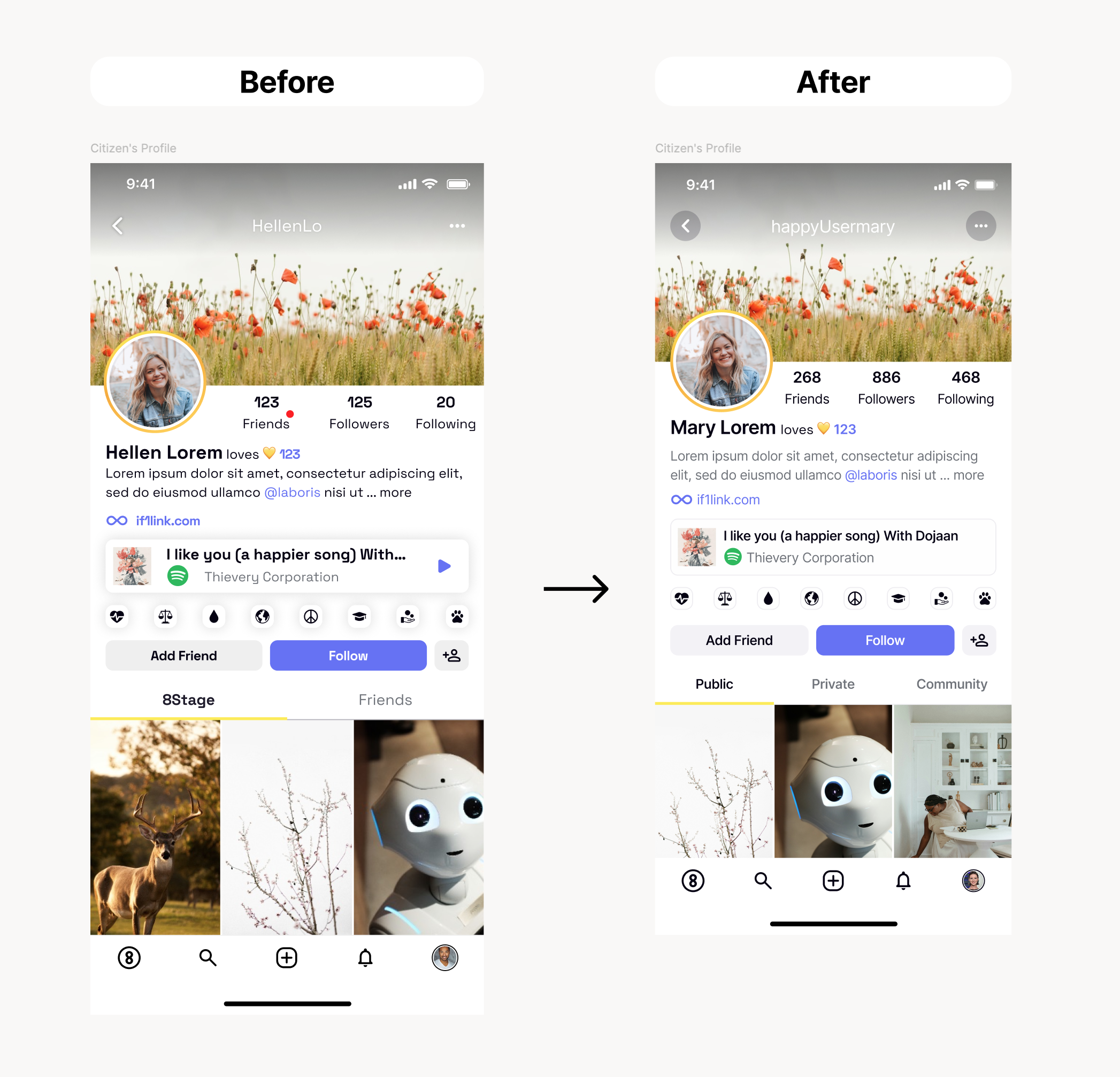
This comparison highlights how the updated design system improved overall visual hierarchy, consistency, and readability. By refining typography, spacing, and component structure, the profile view became easier to scan and more aligned with the product’s social media use cases.