Product Design · iOS · BYLD
Turning workout data into
training guidance users
can understand and act
on.
BYLD already helped users create routines, log workouts, and review their training history. The next challenge was helping them understand what that data actually meant.
I designed a premium experience that translates workout activity into clearer muscle-training insights, helping consistent gym users understand whether their weekly training is balanced, effective, and aligned with their goals.

How might we help users understand what their workout data actually means?
After BYLD MVP launch, user feedback and our own experience as regular gym-goers revealed a gap: users could see what they had done, but they still lacked enough context to understand whether their training was actually effective.
This shifted the product opportunity from simply recording training to helping users interpret it and make better decisions.
Data without enough context
Users could review workout history and performance, but the numbers alone did not explain whether their training volume was appropriate.
Uncertainty around progress
Consistent lifters already knew how to train, but they were not always confident that their routine was giving each muscle enough attention.
Insights needed to lead to action
Showing more data would not be enough. The feature needed to help users understand what the information meant and how it could influence their next workout.
Who would benefit most from deeper training insights?
The original BYLD audience was intentionally broad: intermediate gym users.
For the premium experience, I wanted to identify which users had the strongest need for deeper training guidance. I conducted secondary research across fitness resources, training behaviours, and common workout-tracking patterns. Instead of looking only at experience level, I considered users' goals, consistency, training habits, environment, and awareness of progress.
This narrowed the audience to a more focused core user.
Core User
The Progress-Focused Lifter
They already train consistently and understand how to follow a structured routine.
Their problem is not motivation or learning the basics. They want greater confidence that the work they are doing is actually moving them toward their goals.
They want to know:
- Am I training each muscle enough?
- Is my weekly volume balanced?
- Am I progressing toward my goals?
- What should I adjust next?
This became the primary design focus:
Help consistent gym users understand whether their training volume is effective, balanced, and aligned with their muscle-building goals.
Every feature in the first release needed to support at least one of these outcomes.
Understand
Give users a simple view of how much training each muscle received.
Trust
Make it clear what the numbers represent and how they are calculated.
Act
Help users identify where their training may need adjustment.
What should we build now — and what could wait?
I explored the broader journey from setting training goals to reviewing muscle coverage and receiving feedback during workouts.
For the first version, I prioritized the smallest set of features needed to communicate the core value:
- Set a training target
- See effective sets by muscle
- Compare weekly training against a target
- Understand how the values are calculated
More advanced ideas, including real-time workout recommendations and deeper personalization, were intentionally deferred until the core insight could be validated.
How might we help users understand whether they are training each muscle enough?
Workout-volume data can quickly become technical. The challenge was to provide enough information for users to understand their training without turning every check-in into a detailed analysis. I designed the experience around two levels of information.
Level 1: Overview first
The main view gives users a quick visual understanding of their weekly muscle coverage. It answers the immediate question:
Which muscles have I trained enough this week?
Users can understand their overall status without needing to interpret detailed numbers.
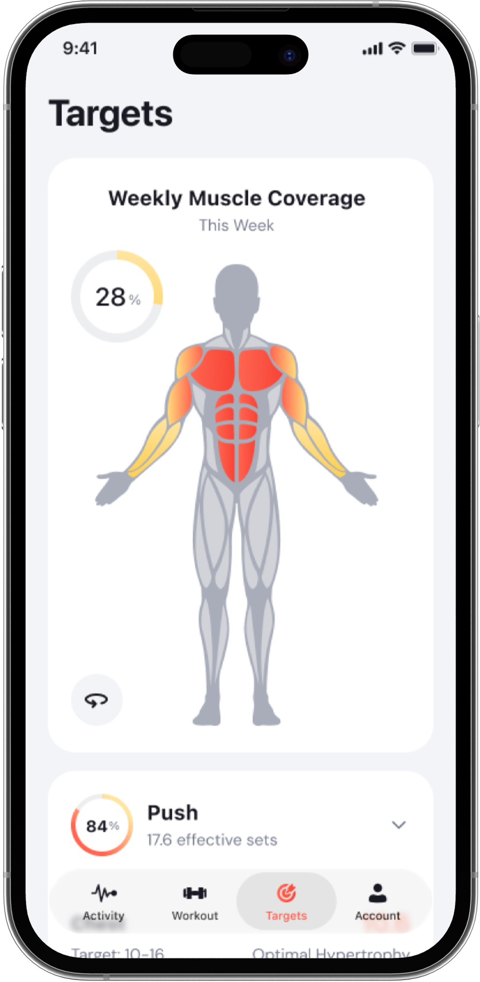
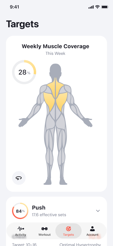
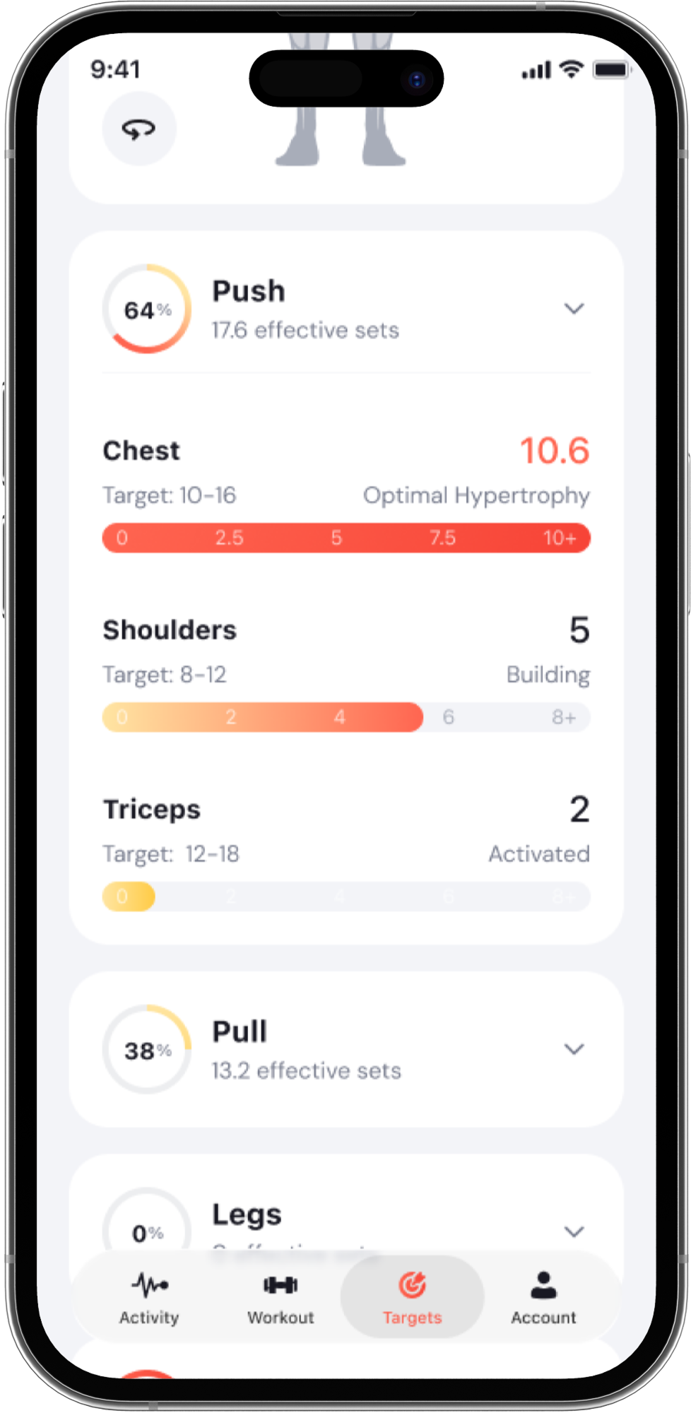
Level 2: Details when needed
For users who want to understand why a muscle received a particular result, a detailed view reveals the effective-set data behind the overview. This creates a progressive experience:
Quick status → deeper explanation
Users are not forced to process every detail immediately, but they can access more context when they need greater confidence or control.
How might we explain a new training concept without overwhelming users?
Because effective sets was an unfamiliar concept, showing the result was not enough. Users also needed enough context to understand where the numbers came from and why they mattered.
Early prototype testing exposed a clear trust gap: participants generally understood that BYLD was evaluating their muscle training, but the connection between their workouts and the effective-set values was not always clear.
What changed
In the initial design, the explanation of effective sets appeared deeper in the experience — after users had already started interpreting the data.
Testing showed that this context came too late. I moved the explanation to the first screen and simplified the language so users could understand what was being measured before interpreting the result.
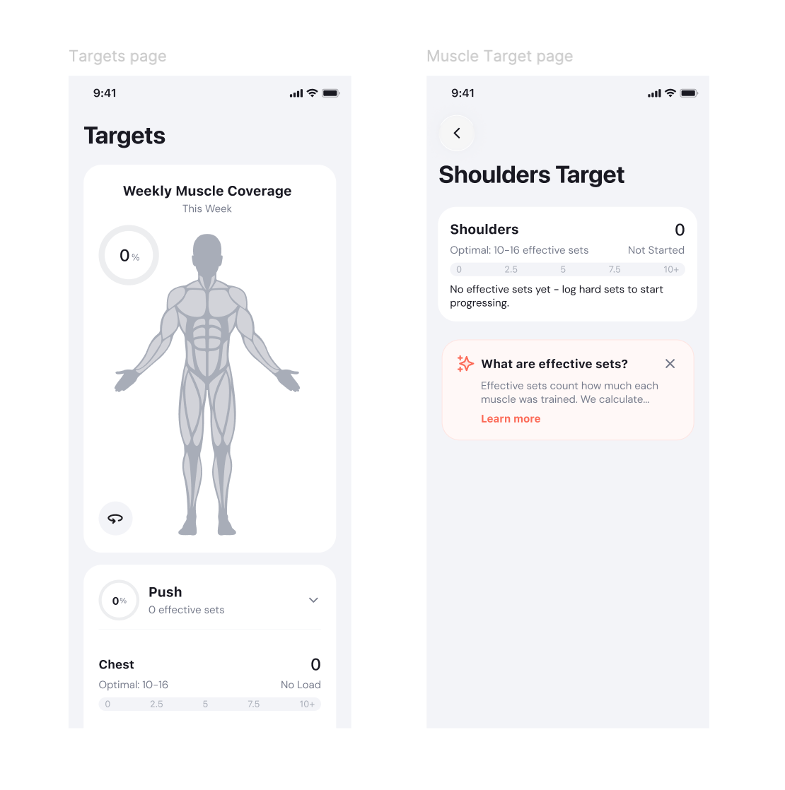
Before
Users saw the result before fully understanding how it was calculated.
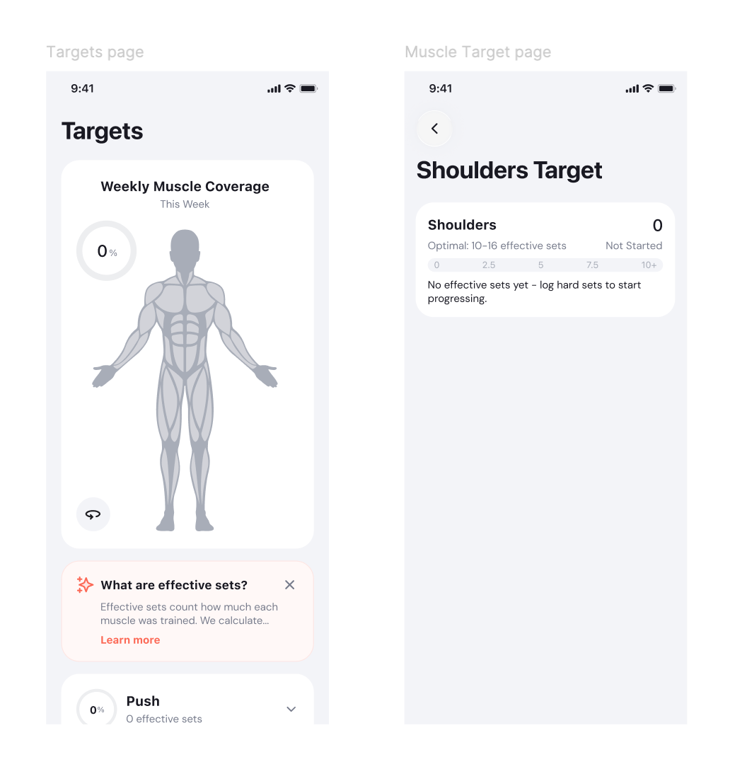
After
Users receive lightweight context first, giving them a clearer foundation for interpreting the data.
The goal was not to explain every technical detail upfront. It was to provide just enough context at the moment it became useful.
How might we make training data feel actionable instead of purely analytical?
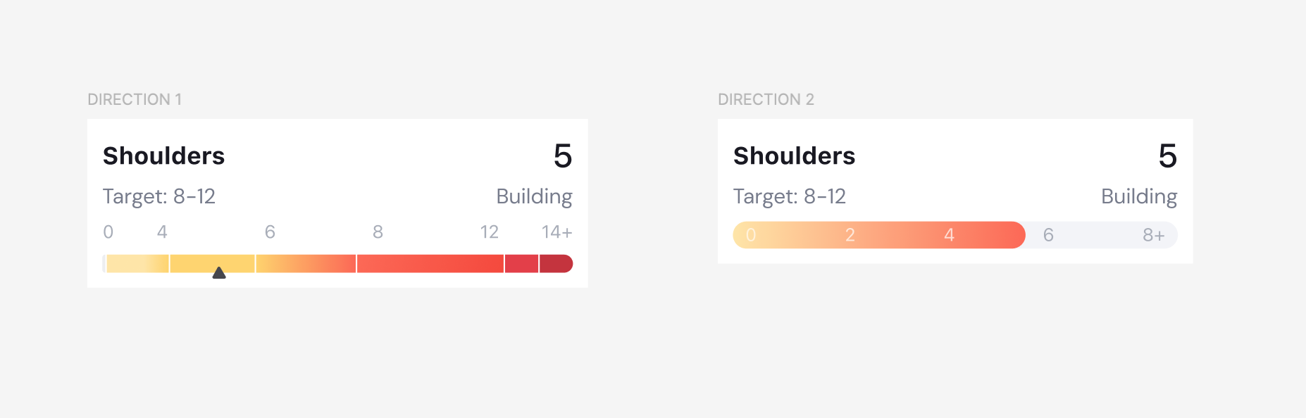
Another important decision was how to visualize weekly muscle coverage against the recommended range. I explored two directions.
Direction 01
Position within a range
The first direction displayed the full recommended range and positioned the user's current training volume within it. This provided greater precision and made it easier to understand exactly where the user stood. The trade-off was that it felt more analytical and required more interpretation.
Direction 02
Progress toward a target
The second direction emphasized progress toward the minimum effective target. Instead of asking users to interpret their exact position within a range, the interface communicated a clearer sense of completion.
Which mattered more: precision or a sense of progress?
Precision
The range model provided more technical precision.
Progress ✓
The progress model provided a stronger sense of direction and accomplishment.
For the first version, I prioritized progress. The goal was not simply to expose a training measurement. It was to help users quickly understand whether their current workouts were moving them toward an appropriate target.
Was understanding the feature enough to make it valuable?
Once the core experience was defined, I created an interactive prototype and tested it with users.
Because the feature introduced unfamiliar training concepts, I wanted to evaluate more than navigation. I focused the testing around three questions.
The comprehension and trust issues directly informed the interface changes shown earlier, including introducing effective-set context sooner.
But testing also revealed a more important product question.
Would users actually do something differently because of the insight?
Users found muscle coverage interesting and useful, but some were unsure whether the insight alone was enough to justify paying for the feature.
For a premium feature, presenting more information is not enough.
“Does the insight help users make a better training decision?”
The experience needs to help users understand what to do next.
Product direction
This became the main opportunity for future iterations: moving from awareness toward clearer, more actionable guidance.
How does the final experience bring everything together?
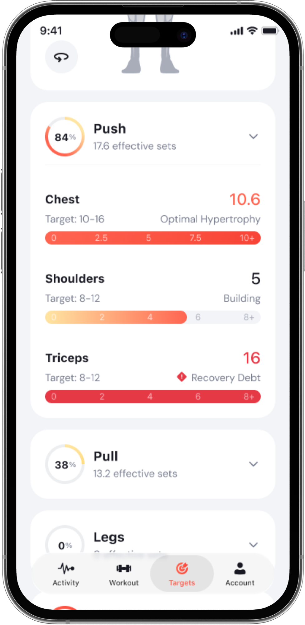
The final design brings premium training insights directly into the live BYLD experience. Users can move from simply recording workouts to understanding how their weekly training is distributed across muscle groups, where they have reached their targets, and where they may need to adjust.
How would I know if the feature is actually solving the problem?
Usability testing can validate whether users understand an experience.
It cannot tell us whether the feature creates meaningful product value after launch. Because this is a premium feature, I would evaluate success across three levels.
Actionability
Does the insight change behaviour?
The strongest signal would be whether users adjust their training after identifying an undertrained muscle group.
For example:
Do users modify their routine or add training volume for an undertrained muscle within seven days of viewing their coverage?
If users repeatedly view the data but never act on it, the insight may be informative without being useful.
Retention
Does the feature become part of the training habit?
I would measure whether users return to muscle coverage as part of their weekly training behaviour.
For example:
Do users check their muscle coverage again during or after future workouts without being prompted?
Repeated use would indicate that the feature provides ongoing value rather than one-time curiosity.
Premium conversion
Is the value strong enough to pay for?
I would track how many users who experience the feature ultimately upgrade to BYLD Premium.
However, I would treat conversion as a downstream metric.
Pricing, paywall timing, packaging, and communication can influence conversion independently of the quality of the feature itself.
For that reason, actionability and retention would be the strongest indicators that the underlying product problem is being solved.
Live Product
Want to explore the experience?
BYLD is available on iOS.